One design system, twenty retail brands
Shared components promise consistency and speed. They also quietly centralise risk. What it takes to run a single UI platform across brands that genuinely want to look different.
Every large retailer eventually proposes the same thing: one design system, used everywhere, maintained once. On a slide, the economics are unanswerable. The catch is that a design system isn't a component library; it's an agreement about who gets to decide how things look, and that agreement is political long before it is ever technical.
Tokens are the treaty
The classic mistake is to start with components. Start with tokens (colour, type, spacing, radius) instead, because tokens are where brand identity actually lives.
The convention most mature systems land on is three layers. If each brand can own its middle layer while sharing the component logic, you get consistency of behaviour without forcing sameness of appearance. That is the entire trick, and the bit everyone skips.
- Global tokens: the raw primitives (a hex value, a spacing step) that no brand gets to override.
- Brand tokens: the semantic layer each brand themes freely, where a primitive is bound to a role like "accent" or "surface".
- Component tokens: the internal wiring that maps the first two onto a button or a card.
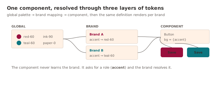
So when a brand team asks "can we make our buttons feel like us?", the answer is yes - at the token layer, without forking a single component, and without a six-week negotiation.
Centralised code, distributed trust
A shared platform centralises risk - one bad release reaches every storefront at once. That single fact changes how you ship everything.
The bar for merging into a shared system is not "does it work for my brand"; it's "would I be comfortable if this shipped to all of them tonight."
In practice that means visual regression tests as a release gate, canary brands that take new versions first and absorb the blast, and a deprecation policy measured in months, not days. The engineering here is genuinely ordinary. The governance is the product, and pretending otherwise is how shared platforms quietly fall over.
Adoption is the only metric that counts
A design system with low adoption is just another library elbowing for attention. The number worth taking to leadership isn't components shipped (that's vanity), it's the percentage of production surfaces actually rendering through the system. That figure tells you whether you've built something teams want to use or something they've been told to use. The two decay very differently, and only one of them survives the first reorg.
Further reading
- The Many Faces of Themeable Design Systems: Brad Frost's three-tier token model applied to exactly this problem (multiple brands, sub-brands, white-label) and the reason the brand layer sits in the middle.
- Design Tokens Format Module: the W3C Community Group spec for the token file format, including aliases and the type system, if you want your tokens to outlive your tooling.
Keep reading
New writing, now and then
Occasional notes on platform engineering, building dependable software and that constant buzz word we doom scroll past on LinkedIn! No cadence promised.